Double Exposure Portraits Reinterpreted
A couple months back I wrote a post on Double Exposure Portrait Photographyand featured many different artists who have contributed their own approach and style to the trend. Since then I've noticed the visual style of these photographs leak into other media of art. It may be that some of these artists have been directly inspired or the similarities are purely incidental, but I've collected some of these artists here for some cool inspiration for superimposed imagery outside the medium of photography.
Oriol Angrill Jorda
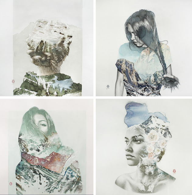
Oriol Angrill Jorda creates these gorgeous blendscapes, as he calls them, using various combinations of acrylic, colored pencil, and graphite with watercolor. Layering the abstract tangibility of substances like water and clouds with the concrete definition of a woman's portrait, these four works maintain a seamless flow between detailed definition and mystic blurs, creating an almost ethereal quality to an otherwise beautiful but normal portrait.

These next four images, also by Oriol, are a little different. They maintain similar elegant combinations of women and nature, but while the patterns of clouds and water extend beyond the silhouette in the top set, these patterns and images remain mainly within the boundaries of the figure. The illustration of the girl on the top right, for example, looks like she's wearing a painted landscape as a shirt, an item of clothing I would not mind owning. In contrast, the woman on the bottom left is lost almost completely behind mountainous layers with only the folds of her hair and one eye peeking over the landscape.
For a glimpse into the Oriol's process check out this video below:
Oriol Angrill Jorda
Oriol Angrill Jorda creates these gorgeous blendscapes, as he calls them, using various combinations of acrylic, colored pencil, and graphite with watercolor. Layering the abstract tangibility of substances like water and clouds with the concrete definition of a woman's portrait, these four works maintain a seamless flow between detailed definition and mystic blurs, creating an almost ethereal quality to an otherwise beautiful but normal portrait.

These next four images, also by Oriol, are a little different. They maintain similar elegant combinations of women and nature, but while the patterns of clouds and water extend beyond the silhouette in the top set, these patterns and images remain mainly within the boundaries of the figure. The illustration of the girl on the top right, for example, looks like she's wearing a painted landscape as a shirt, an item of clothing I would not mind owning. In contrast, the woman on the bottom left is lost almost completely behind mountainous layers with only the folds of her hair and one eye peeking over the landscape.

For a glimpse into the Oriol's process check out this video below:

Here Pat Perry puts his own unique spin on a landscape-portrait illustration by featuring dilapidated scenes of broken sheds and junk with barren trees in the background instead of sweeping arrays of mountains and forests. The heads of these portraits are clearly distorted upwards and out, but while the landscape goes freely beyond the shape of the person, it does not fill the entire upper page space and neither does it go beyond where the neck and collar meet. This, combined with those hints of nose, lips, and chin, maintain an attractive balance and allow both landscape and person to sit comfortably side by side.

These graphite portraits are the most surreal and multi-exposure-esque of a series that is admittedly better in its complete state. Zsaitsits uses all sorts of variables to combine his images on top of each other. Most of the overlapping takes place on the face and the portrait in the middle row on the left is the only one whose features are completely covered by very unface-like imagery. I think my favorite one though is its partner on the right whose hair is replaced by a forest of trees and a bear looks to be standing above his den, also known as the person's right eye.

Thomasz Trafial
These portraits take a more abstract and dark route than the others in this post. I find the illustration on the top left with the scratchy, crisscrossed lines and blurred edges, combined with that menacing staring eye, particularly spooky. And the one on the bottom left is a combination of such vague imagery that the shape of the neck and shoulders, the darkened shadow of the chin, and the vague definition of the ear on the left, is all that is given to tell us it is a portrait, but a portrait it undoubtably is. In fact, all four of these drawings generally reveal little information, but it is the unknown that can often be the scariest of all, so perhaps this lack of information is what really adds to the darkness of these works.


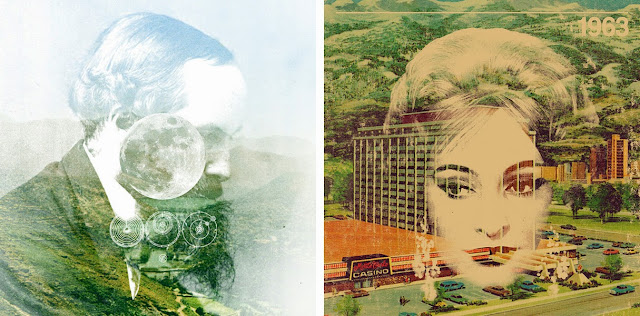
These first four of Mark Weaver's vintagey collages are most clearly related by the fact that the collage is all happening within a constrained space surrounded by a flat tan-ish color. The portrait on the bottom right differs from the others because it is a circle that holds the images together instead of the frame of the figure itself. This gives the illusion that the woman rests atop of the other pictures rather than the other way around. In the portrait of Bob Dylan on the top left, most of his figure is overcome by imagery that is not his own except for the area of his neck tie up the left side of his face. The image of the small boy below Bob where just the highlights of the turn of his cheek and eyes are shown through the collage is even more subtle.

These next two Weaver collages differ by having the background image cover the whole of the piece so the portrait looks to be superimposed on top. Notice how the woman's beigeish face is completely opaque in spots while the man's face never seems to fully emerge from the landscape in which it sits.
These portraits take a more abstract and dark route than the others in this post. I find the illustration on the top left with the scratchy, crisscrossed lines and blurred edges, combined with that menacing staring eye, particularly spooky. And the one on the bottom left is a combination of such vague imagery that the shape of the neck and shoulders, the darkened shadow of the chin, and the vague definition of the ear on the left, is all that is given to tell us it is a portrait, but a portrait it undoubtably is. In fact, all four of these drawings generally reveal little information, but it is the unknown that can often be the scariest of all, so perhaps this lack of information is what really adds to the darkness of these works.
The black and white portrait on the top left is a normal double exposure piece that combines one person's face looking in two different directions to create a rather surreal image. But the other three use a clever method to create a similar but very different effect. The starry or explosive views that combine with the body are actually images projected directly onto the figure itself, the entirety of which is then photographed. This offers opportunities for cool effects like the blue back lighting for contrast on the other side of the body and the distortion of the projected image in the places where the body curves, (this is particularly apparent in the portrait on the bottom left where the stars spread to lines across the side of the man's face and shoulder.)

I think the line between superimposed photography and digital collage can get a little blurry, considering both can be done by simply combining images with photo-editing software. And frankly, I'm not really sure where exactly to place the difference. But I think two factors that can distinguish are whether the images are found photos (a process indicative of collage) or photographed by the artist himself, and how much the image is changed and added to after the initial overlapping. So, with that in mind, these next three artists use varying levels of manipulation to create their own digital collages.
Both of these portraits would be almost completely flat silhouettes without the strategic use of highlights and changes in tone to give just enough hint to the shape and form of the figure. The photo on the right for example, uses several subtle but easy to spot highlights to give just enough definition to the shape of the ears, collarbone, and hairline. The portrait on the left uses even subtler hints of definition. The depth of the back and shoulders fades and mixes with the background, just a small curved highlight gives us the placement of an ear, and a small cloud sits loosely where the eye should be.

These next two Weaver collages differ by having the background image cover the whole of the piece so the portrait looks to be superimposed on top. Notice how the woman's beigeish face is completely opaque in spots while the man's face never seems to fully emerge from the landscape in which it sits.

Matt Wisniewski
These collages also by Wisniewski give more dominance to the natural, and in one case architectural, pictures than the previous four. While their portrait counterparts still maintain a comfortable base for creation, more freedom is given to these other objects to challenge and go beyond the shape of the figure. This is especially true in the portrait of the bottom right where the architectural arches cleverly form around the place of the glasses and much of the woman's hair is lost in place of the top of the building. And the portrait of the man on the top left is particularly clever. If you notice, the outlines of the mountainous ranges are mirrored and replace both the top and bottom of his head. I like the wisps of hair that show up along the rocks on the left side as well.

To make his digital collages, Matt Wisniewski scours the interwebs and places like Tumblr for eye catching photographs and combines them to create his own unique colorful and imaginative works. The act of overlaying natural imagery, landscapes, and flowers, on top of portraiture definitely creates an attractive effect, as we've seen in so many examples above, and I partcularly love the bottom two images where flowers creep up across the person's face.

No comments:
Post a Comment